UX & Conversion
September 3, 2026Product Page Patterns That Reduce Hesitation
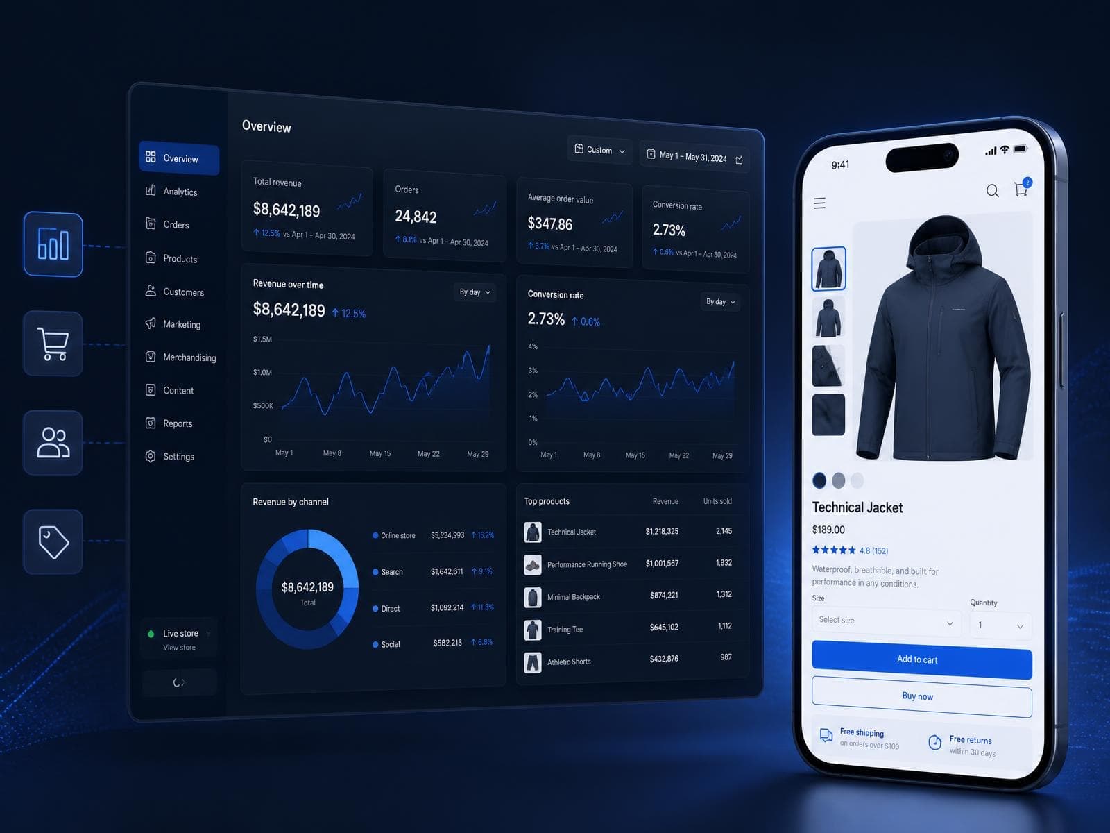
Structuring variants, shipping expectations and policy information so customers stop leaving to look for answers.
Hesitation on a product page is rarely about the product — it is about unanswered logistics questions: which variant is actually in stock, what shipping will cost before checkout, and what happens if the item does not fit or is not right. Every one of those questions a customer has to leave the page to answer is a chance they do not come back.

The pattern that works: surface stock and shipping estimates inline near the add-to-cart control, keep return policy one click away rather than buried in a footer link, and use real variant imagery instead of a single hero shot for anything where appearance varies meaningfully by option.
Related service
ecommerce UI/UX designWant to talk about your project?
Ready to Build a Better Ecommerce Experience?
Tell us about your ecommerce business, current platform and goals. Our team can help identify the right development, optimization or growth strategy.